

Where it lives
Branding & White-label sits under Settings, at Portal settings.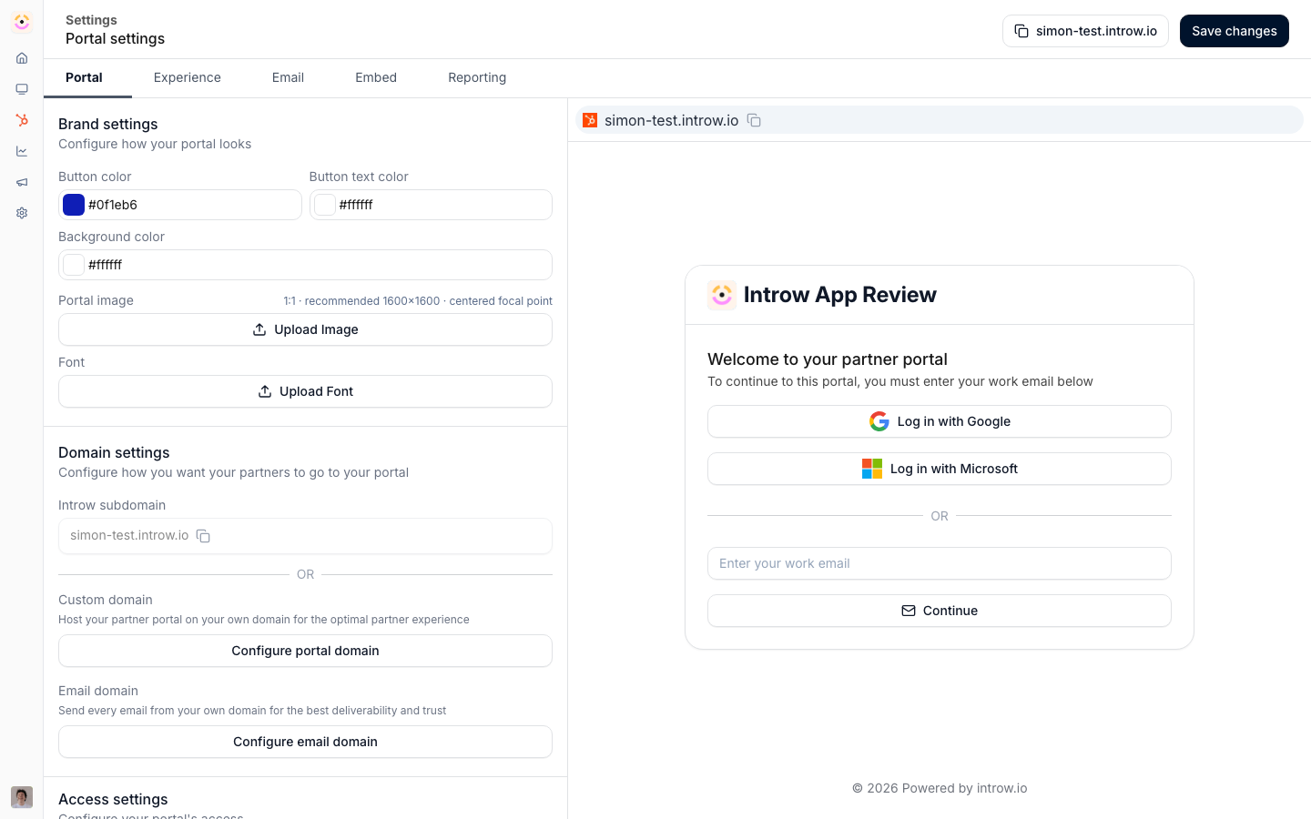
Before you start
How it works
Branding holds your visual identity: logos, brand colors, font, and login copy. Logos are set once in company settings because they identify your organisation everywhere, and the colors, font, and login copy live in portal settings, split across branding tabs for the login screen, the experiences inside, emails, and assets. Configure them once and they propagate to every partner-facing surface. The login screen has its own colors and editable copy so the first thing a partner sees is on-brand, and email notifications carry the same brand so messages partners receive look like they came from you. Introw fills most of this in for you when you set your company domain: it reads your website and brand data for your logos, a portal image, your favicon, and your accent colors, so the portal is already recognisable before you change anything. Everything below is the override. Images are not only a branding-settings concern - thumbnails, banners, and badges live across courses, content, announcements, and tiers. Image sizes below lists every image you can upload in Introw, with the ratio and size for each.Settings & configuration
Logos are managed at Company settings; colors, font, and login copy are managed on the branding tabs of Portal settings.Logos
Upload a square logo and a horizontal logo in company settings. The square logo is the one that carries your brand: the portal header, the login screen, the header image on notification emails, the org avatar on announcement cards, the fallback avatar for the partner support agent, and the certificate seal when no horizontal logo is set (drawn 124×124). It renders in square avatar frames from 16px to 64px and is cropped to fill, so a wide file loses its sides - upload a square one. The horizontal logo is used where a full lockup fits: the top of certificates (320×72) and the generated cards Introw renders for assets with no previewable file (up to 280×64). Both fit it inside the box rather than cropping. Neither logo drives the favicon: Introw uses the favicon published on your company domain. Removing the Introw mark. The white-label add-on drops the “Powered by Introw” mark from the partner-facing surfaces that carry it - the portal, forms, the asset library, and generated certificates - so what partners see is your brand only.Portal image
Portal image, on the login branding tab of portal settings, is optional artwork for the login screen. It fills the panel beside the sign-in card on desktop - roughly 60% of the window’s width at full height, so close to square - and is hidden on mobile. It crops to fill, so upload roughly square artwork with a centered focal point rather than a wide banner, and expect the edges to move as the window changes shape. Introw stores it as a JPG, so transparency is flattened.Image sizes: every image in Introw
This is the full list, brand assets and everything else, so you can prepare artwork in one pass. Each feature’s own How to page repeats the rows that belong to it. Three behaviours decide what to upload, and each row says which one applies:- Cropped on upload - the upload opens a crop-and-zoom step and saves at exactly that ratio, so anything off-ratio loses its edges permanently. Upload at the ratio to keep control.
- Cropped to fill - stored as uploaded but always displayed filling a square frame, so a wide file loses its sides on every surface.
- Fitted or as uploaded - never cropped. Ratio is up to you; the recommendation is only about resolution.
Brand assets
Content and courses
Partners, portal and people
Three things that apply everywhere. Thumbnails are served downscaled to 1080px wide, so uploading
more than about 1920×1080 buys nothing. Where no cap is listed, the generic 2 GB upload limit
applies, which is far more than any image needs - a heavy file only slows the portal down. And
every slot marked “AI can generate it” carries a Generate with AI button that reads the
content behind the image (the asset, the folder and its contents, the announcement’s text, the
course and its modules) plus your brand colors, then produces artwork at exactly the size in this
table. Generated images are always text-free, since image models render text unreliably.
Brand colors
Set button, button text, background, header, and active tab colors on the portal branding tabs. These theme the login screen, the experiences partners see, and emails, keeping everything consistent with your identity.Fonts
Use the default font or upload a custom font file in portal settings to match your brand typography across the portal.Login screen
Brand the login screen with your colors, logo, and editable copy for each step of sign-in, so the first sign-in feels like your product rather than a generic page.Email notifications
Partner email notifications inherit your brand colors and logo so outbound communications stay consistent with the portal.How-to guides
Troubleshooting
A logo looks blurry
A logo looks blurry
Upload a higher-resolution asset for that slot (512×512 square, 800×200 horizontal).
The portal image looks cut off
The portal image looks cut off
It is cropped to fill a near-square, full-height panel; re-upload roughly square artwork with the focal point centered.
The font did not change
The font did not change
The uploaded file is not in a supported format.
Emails are not branded
Emails are not branded
Confirm the brand assets are set in branding settings.