

What you’ll achieve
A partner portal styled top to bottom in your brand: your logos in headers and icons, your colors on buttons, tabs, and backgrounds across both the login screen and the experiences, your font rendering portal text, and login copy written in your voice. Partners experience a branded product from the login page onward.Before you start
1
Know which branding controls are gated
Removing Introw branding and using your own font are plan features; the rest of the branding controls are available on every plan. Check what yours includes at introw.io/pricing.
2
Confirm admin access
You need admin access to company and portal settings to change branding.
3
Gather your brand assets
Have your logo files (a square version and a horizontal version), your brand color values, a font file if you use a custom typeface, and optionally a portal image for the login screen. Sizes:
Watch it
- Video
- Click through
Steps
Add your logos
1
Open company settings
Go to Company settings. Logos are set here because they identify your organisation across every surface, not just one portal.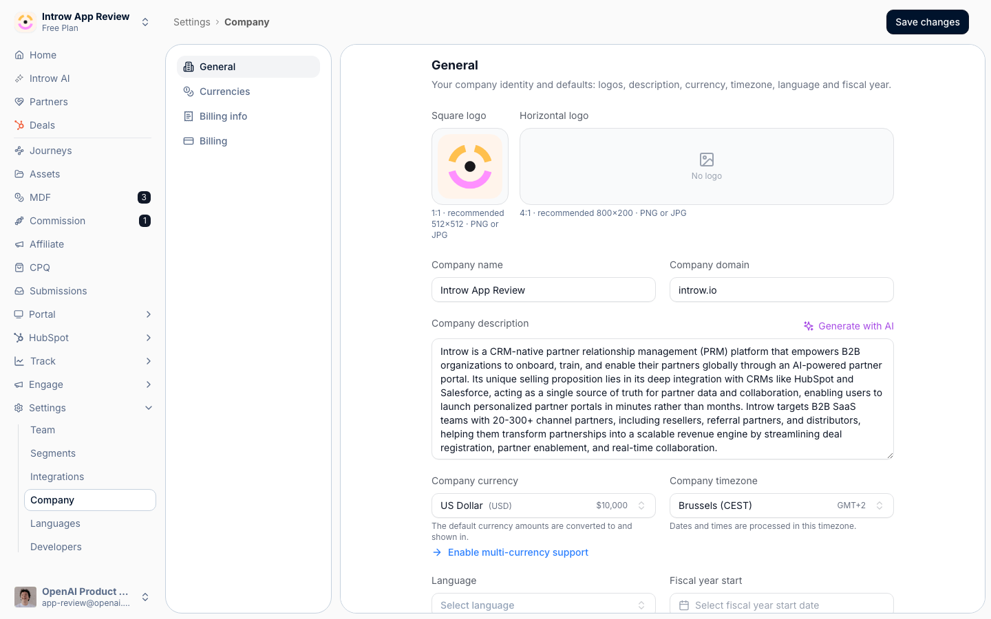
2
Upload both logo formats
Add each logo so Introw can pick the right one for each context: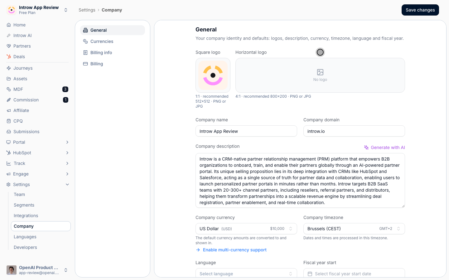
- Square logo - the one partners see most: the portal header, the login screen, the header image on every notification email, and next to your name on announcement cards. It is always drawn in a square frame between 16px and 64px and cropped to fill, so upload a genuinely square file - 512×512 is plenty - with the mark centered and a little breathing room around it. A wide logo here loses its sides.
- Horizontal logo - used where there is room for a full lockup: the top of certificates (drawn at 320×72) and the generated cards Introw makes for assets that have no preview. It is fitted, never cropped, so any wide shape works. Roughly 4:1 at 800×200 is a safe upload.
Set the portal and login colors
1
Open portal settings
Go to Portal settings. The first tab controls the login screen and the portal shell partners sign in to. A live preview updates as you change each value.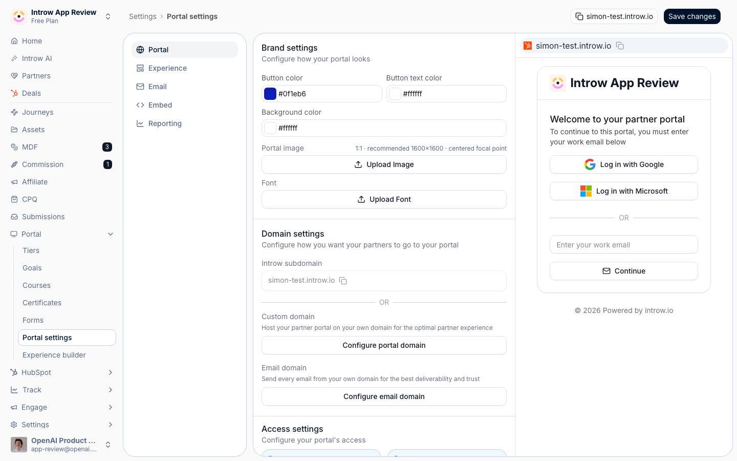
2
Set the portal colors
Each color is chosen with a color picker; pick the brand value or paste a hex code: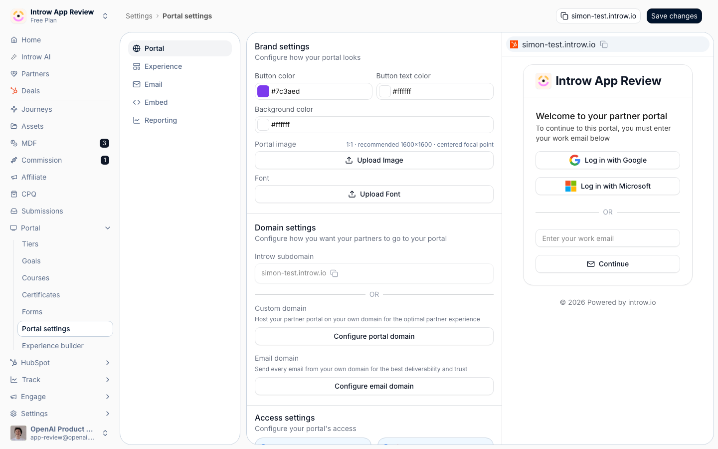
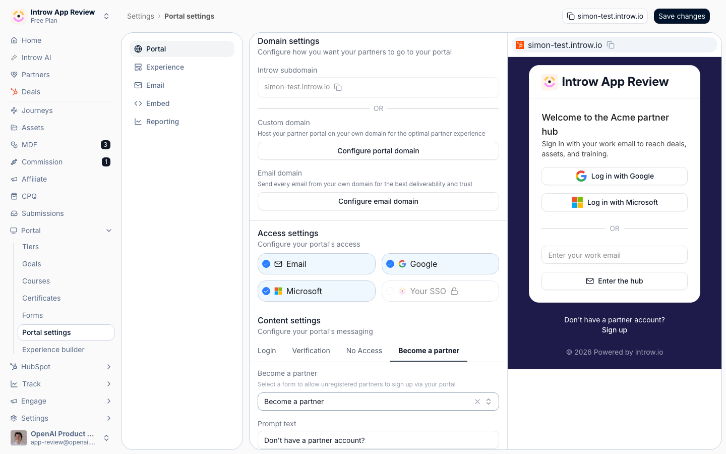
- Button color - the fill of primary buttons on the login and portal. Use your primary brand color so the main action stands out.
- Button text color - the label color on those buttons. Introw measures it against the button color and keeps your value only when the contrast is at least 3:1. Below that, the label falls back to white or dark automatically, so check the preview if a button does not show the color you picked.
- Background color - the page background behind the login and portal shell. A dark brand color works too: the Don’t have a partner account? prompt and its Sign up link under the login card, which sit on two lines, switch to a readable color, and the experience builder, the settings preview and the activity and AI panels use the same background, so what you see while building is what partners get.
3
Add a portal image
Under Portal image, select Upload Image to put your own artwork on the login screen. The image fills a full-height panel next to the sign-in card on desktop, and is hidden on mobile.That panel is about 60% of the window’s width and its full height, so it is close to square and it crops to fill. Upload roughly square artwork - 1600×1600 works well, and anything under about 1200px per side looks soft on large screens - and keep the focal point centered, because the edges are what get trimmed as the window changes shape. A wide banner is the one thing to avoid here. Introw stores this image as a JPG, so transparency is flattened: use a photo or a solid-background graphic. To remove it later, select the X next to Portal image uploaded.
4
Upload a custom font
Upload your brand font file so portal text renders in your typeface instead of a generic system font. Use a supported web font format; if no custom font is uploaded, the portal falls back to its default font.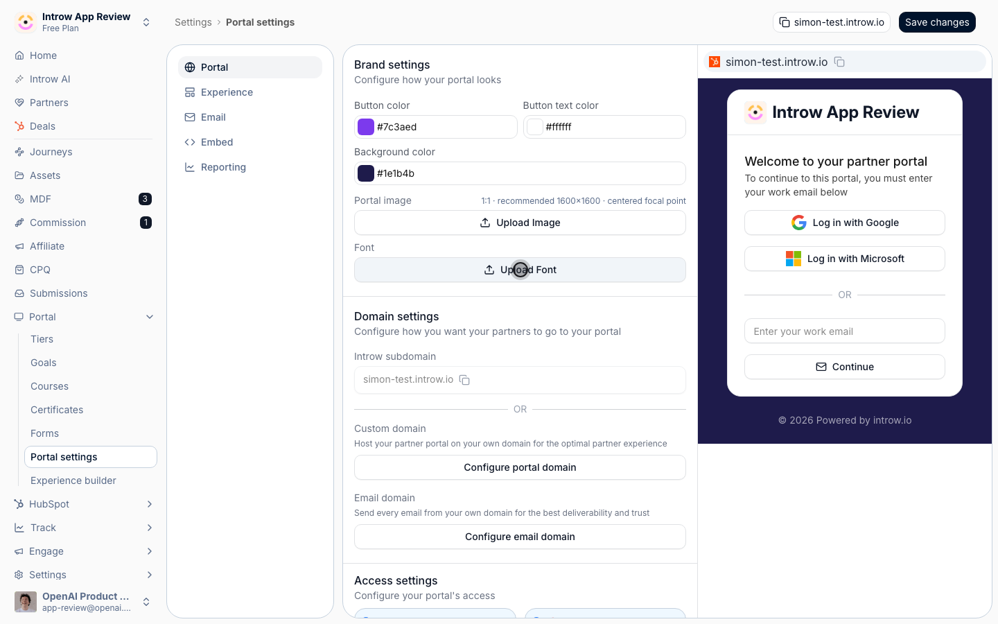
Theme the experience chrome
1
Open the Experience branding tab
Still in Portal settings, switch to the Experience branding tab. These colors theme the experiences partners see after they log in, which have more surfaces than the login screen.
- Header color - the background of the experience header bar. Default is white; set it to a brand tone if you want a colored header.
- Background color - the page background behind experience content.
- Button color and Button text color - the fill and label of buttons inside experiences, matching the login styling.
- Active tab color - the highlight on the currently selected stage tab, so partners can see where they are. Use an accent color that reads clearly against the header.
Customize the login copy
1
Edit the login screen text
On the login branding tab, override the default wording so the sign-in page speaks in your voice. Each step of the login flow has editable copy:
- Enter email step - the Title, Subtext, email field Placeholder, and Button text partners see when they first arrive. There is also an SSO button text shown when single sign-on is offered. Leave any field blank to keep the default wording.
- Verification step - the Title and Subtext shown while a partner confirms the link sent to their email.
- No access step - the message shown when someone without access tries to sign in, so they know how to request it.
2
Save and preview
Settings save as you edit; use the live preview to confirm the login screen and experiences reflect your brand before partners see them.
Verify it worked
Open the portal login screen: it shows your square logo, your colors on the button and background, your font, your custom copy, and your portal image filling the panel beside the sign-in card. Sign in and open an experience: the header, tabs, and buttons reflect the experience colors, and your logo sits in the header. The brand now applies everywhere partners look.Related
Brand email notifications
Carry the brand into the emails partners receive.
Build and publish a portal experience
Build the experiences your branding themes.
Connect a custom domain
Serve the branded portal on your own hostname.
Implementation reference
Full branding configuration options.