

For partner ops who want a single, shareable view of program performance.A dashboard turns a handful of related reports into one view your team returns to, instead of hunting through individual charts. Reports are the building blocks, so you create them first in the report builder, then assemble them here. Building one - and filling it with the right reports in a readable layout - gives everyone a shared, focused picture, like a partner-attached pipeline dashboard scoped to a tier and a quarter. This guide takes you from an empty dashboard to a populated, filtered view.
What you’ll achieve
A saved dashboard that holds your chosen reports in the layout you arranged, scoped by audience filters and a date range, ready to share with your team or embed in a partner portal.Before you start
1
Confirm reporting is on your plan
Reporting is a plan feature, and plans cap how many saved reports and dashboards you get. If you hit the cap or see an upgrade prompt, check what your plan includes at introw.io/pricing.
2
Save the reports first
A dashboard is built from saved reports, so create the reports you want to include before you start. See Build a report in the report builder.
3
Confirm reports access
You need reports write access to create and edit dashboards.
Watch it
- Video
- Click through
Steps
Create the dashboard
1
Open Dashboards
Go to Dashboards. Each dashboard appears as its own tab, so you can keep several views side by side.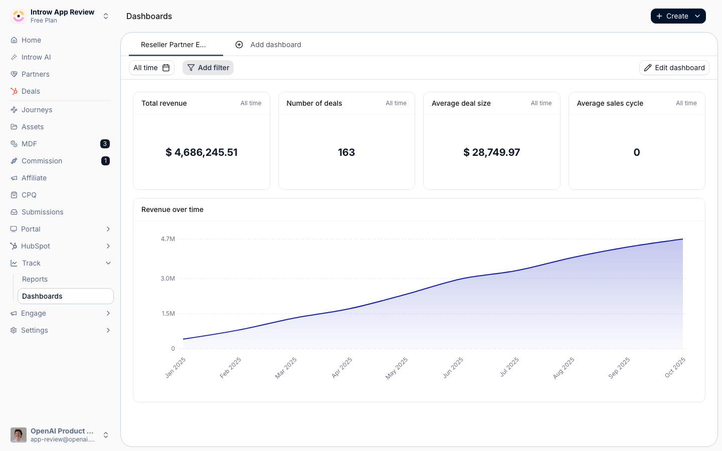
2
Add a dashboard and name it
Create a new dashboard tab and give it a clear name, for example “Partner pipeline”. The name labels the tab and identifies the dashboard when you embed it in a portal.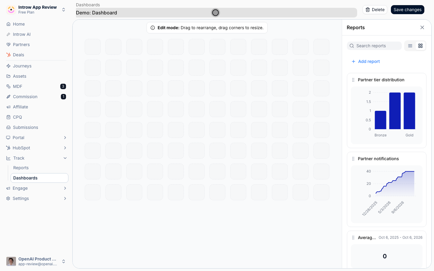
Add and arrange reports
1
Open the report sidebar
With the dashboard open, edit its layout. The sidebar lists your saved reports; search it to find the one you want.
2
Add reports to the grid
Drag a saved report from the sidebar onto the grid. Repeat for each report you want on this dashboard. Only saved reports you have access to appear in the list.
3
Arrange the layout
Resize and reposition each report on the grid so the most important charts read first. The grid keeps the arrangement you set.
Scope and save
1
Set audience filters and a date range
Apply the dashboard-wide controls that flow into every report on it.
- Audience filters - scope the whole dashboard to a set of partners (for example a tier or segment), so every report reflects the same audience.
- Date range - choose a preset that frames the period all reports cover, so the dashboard tells one consistent time story.
2
Save the dashboard
Save the layout. The dashboard is now available as a tab and can be embedded in a partner portal.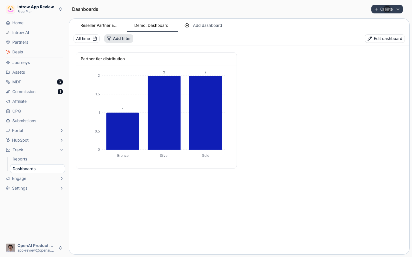
Verify it worked
The dashboard appears as a tab on Dashboards and shows your reports in the layout you arranged, with the audience filters and date range applied across every report.Related
Embed a dashboard in the portal
Share it with partners.
Build a report
Make more reports to add.
Implementation reference
Full configuration options.