

For partner ops and RevOps who need a custom view of partner-attached performance.A report turns raw CRM and partner activity into a chart your team can act on, like partner-attached revenue over time or deals by tier. Building one from scratch lets you measure exactly what your program cares about and then reuse it on dashboards and in partner portals, so you stop pulling the same numbers by hand. This guide takes you from an empty report all the way to a saved, reusable chart.
What you’ll achieve
A saved report that visualizes the data you chose, shaped by the metric, grouping, and filters you set, ready to add to a dashboard or embed in a partner portal.Before you start
1
Connect your CRM
CRM-based reports need a connected CRM with the relevant objects mapped. Introw-native sources (partners, engagement, assets, certifications, commissions, emails, and marketing funds) work without extra setup.
2
Confirm reports access and quota
You need reports write access, and your plan must have report quota available. Unlimited plans have no cap.
Watch it
- Video
- Click through
Steps
Start the report
1
Open Reports and create a report
Go to Reports and create a new report. The builder opens with a configuration panel on the left and a live preview on the right that updates as you go.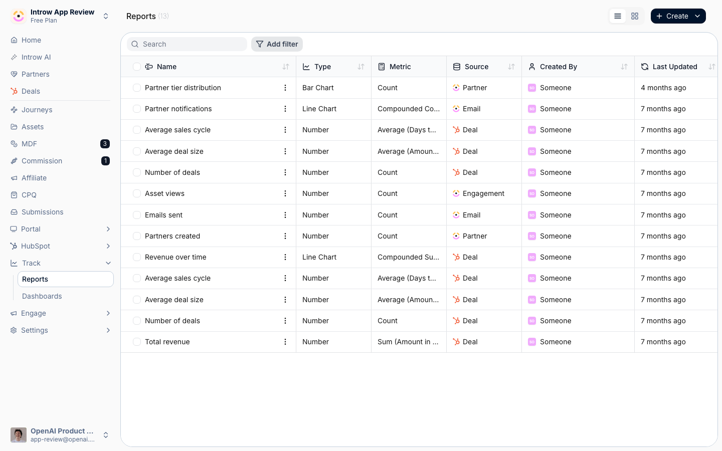
2
Name the report
The report opens as Untitled report. Select the title to rename it to something your team will recognize, for example “Partner-attached revenue by quarter”. The name is how the report appears in lists, on dashboards, and in portal embeds.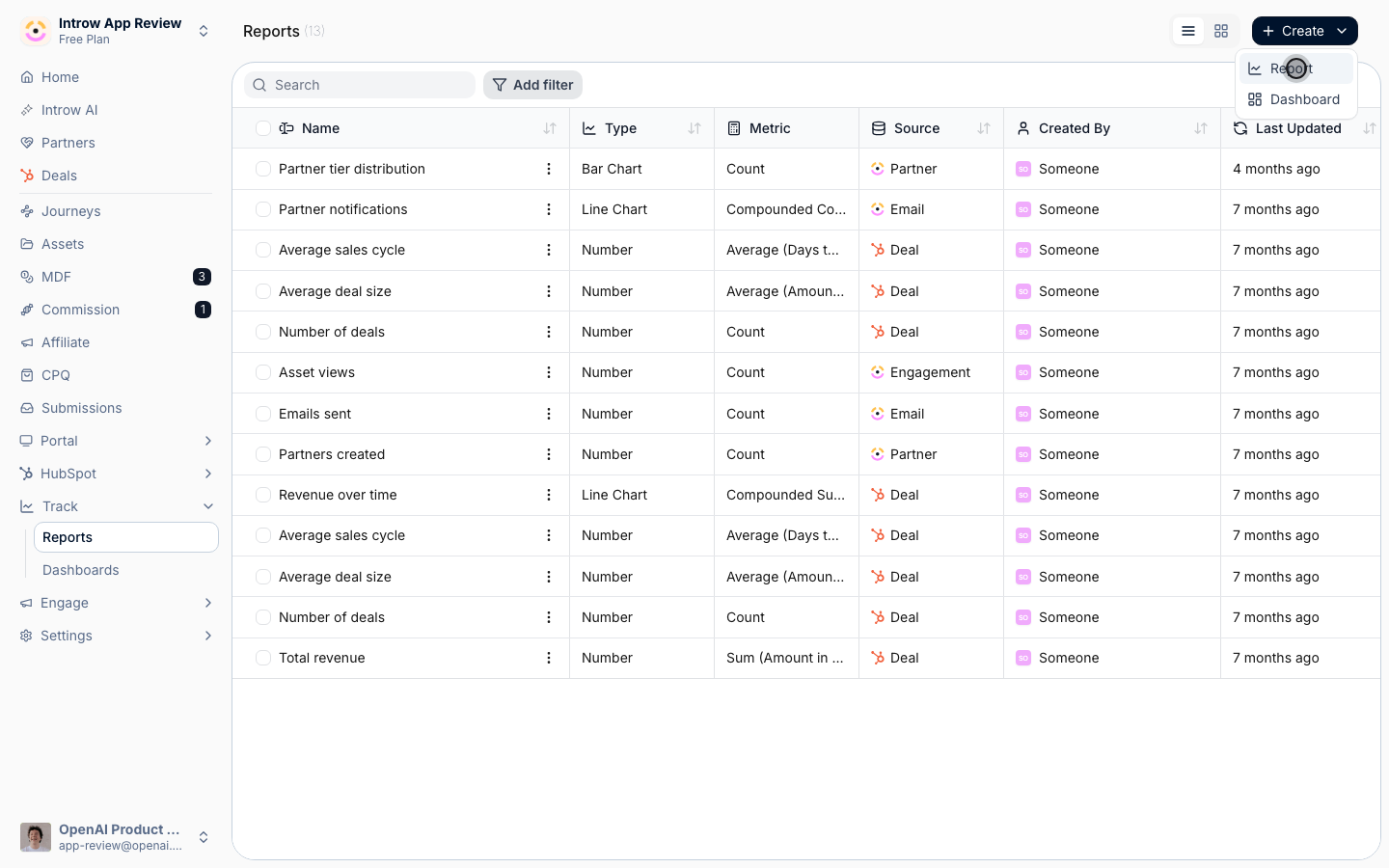
Configure the report
The Configure tab holds the core setup as a stack of sections. Work top to bottom; the preview re-renders after each change.1
Choose the data source
Open the Data source section and pick what the report measures.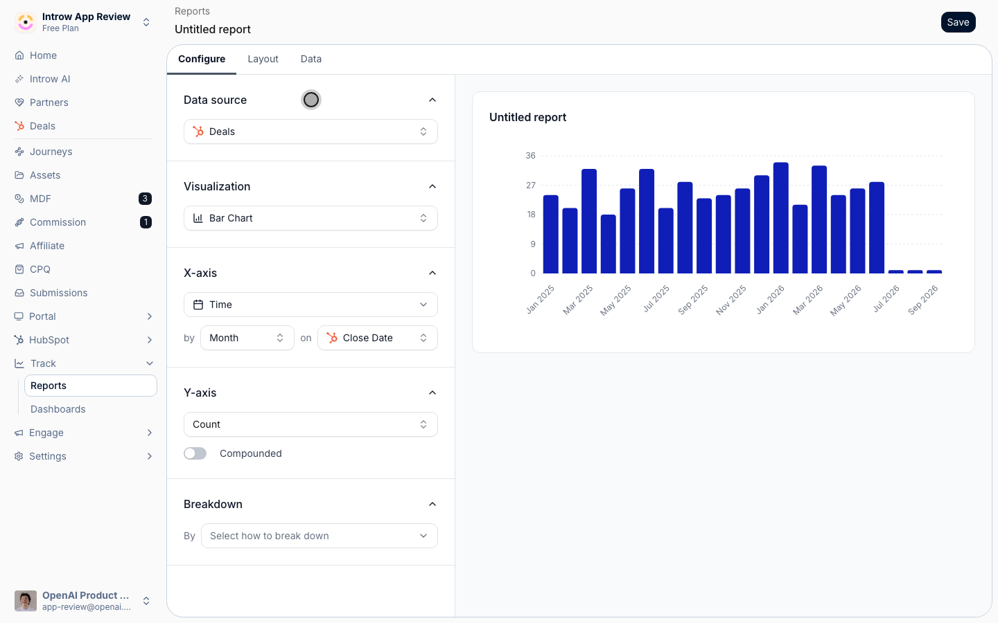
- Data source - the object the report counts and groups. Choose a CRM-mapped object such as deals, contacts, or companies, or an Introw-native source: partners, engagement, assets, certifications, commissions, emails, or marketing funds. This choice drives every other option, so set it first. Changing it later resets the grouping, metric, and filters.
2
Pick the visualization
Open the Visualization section and choose how the data is drawn.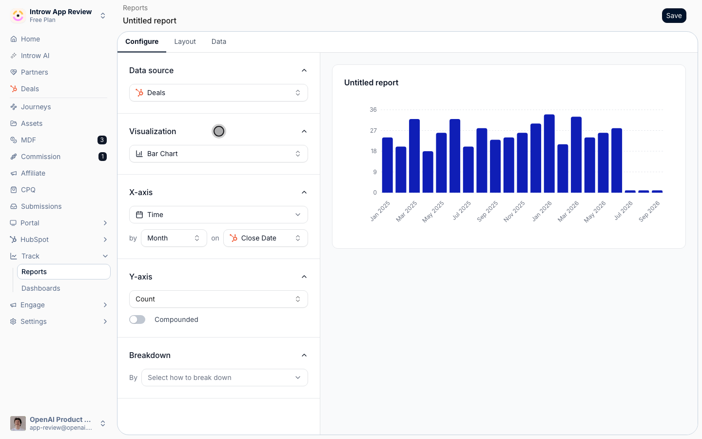
- Bar chart - compares a value across categories or over time. The default and the best all-rounder.
- Line chart - shows a trend over time; it groups by time only.
- Number - a single headline figure, with optional period comparison.
- Pie chart - shows how a total splits across categories; it cannot group by time.
3
Set the X-axis (grouping)
For a bar, line, or pie chart, open the axis section (labelled X-axis, or Breakdown for pie) to decide how data is grouped.
- Grouping - the dimension along the axis. Pick Time to trend over periods, or a partner dimension (partner, attribution, tier, phase, experience, or a partner team role) or a CRM property of the data source (such as deal stage, or a region field on the partner account). Pie and number views group by a category rather than time.
- Time interval - when grouping by Time, choose the bucket: day, week, month, quarter, or year. Month is the default.
- Date property - for CRM object sources, the date field used to place each record into a period (for example created date or close date). Set this to match the question you are answering.
- Included values - optionally limit the axis to specific values (for example only certain tiers or stages) so the chart stays focused.
4
Define the metric
Open the Metric section (shown as Y-axis on bar and line charts) to set what is measured.
- Aggregation - how values are rolled up: Count of records, or Sum or Average of a property. Count answers “how many”; the others answer “how much”.
- Of (property) - when the aggregation is not a count, the numeric or currency property to aggregate, for example deal amount, commission amount, or a number rolled up onto the partner account such as total ARR. See Report on partner account fields.
- Compounded - when grouping by time, turn this on to show a running cumulative total across periods instead of each period on its own. Use it for “revenue to date” style views.
5
Add a breakdown
For bar and line charts, open the Breakdown section to split each bar or line by a second dimension.
- Breakdown - the secondary grouping, for example split partner-attached deals by tier within each month. Leave it empty for a single series.
- Stack on top of each other - when a breakdown is set, stack the series into one bar per period rather than placing them side by side. Stacking reads best for part-of-whole comparisons.
6
Compare periods (Number only)
For a number visualization, open the Period section to add a period comparison, so the figure shows movement against the previous period instead of a static total.
Filter and refine
1
Filter the data
Switch to the Data tab. Beyond showing the underlying rows, it holds the report’s filters.
- Data filters - narrow the records the report counts by properties of the data source, for example only closed-won deals or deals above a value.
- Audience filters - scope the report to a set of partners or partner contacts (for example a tier or segment), so the chart reflects only the relationships you care about. Audience filters are also what keep a shared report safe: a partner viewing it sees only data they are allowed to see.
2
Refine the layout
Switch to the Layout tab to fine-tune how the chart reads. The options shown depend on the visualization, and typically include legend and data labels, compact number formatting, currency formatting, bar orientation, sorting by value, and a top-N limit to show only the largest categories. These are presentation choices and do not change the underlying numbers.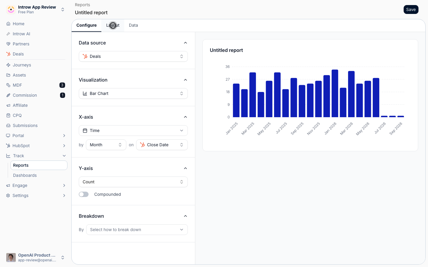
Save and reuse
1
Save the report
Save the report. It now appears on the Reports page and is available to add to dashboards and to embed in partner portals. New reports are private to you until you add them to a shared surface.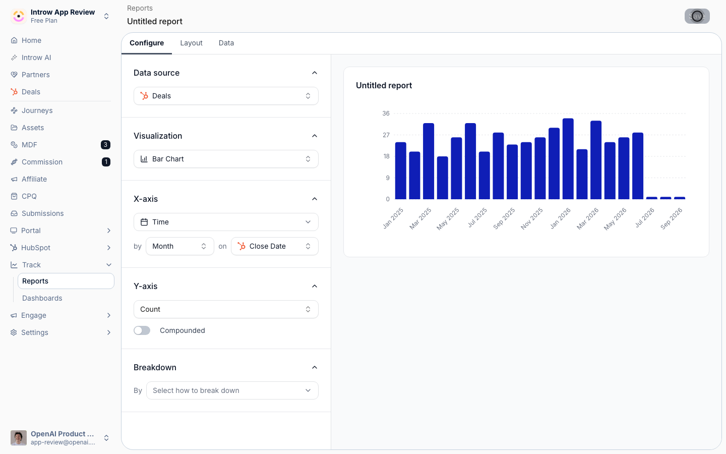
Verify it worked
The live preview matches the chart you intended, and after saving, the report appears on the Reports page with your name, metric, and grouping. Open the Data tab to confirm the underlying rows are the records you expect.Related
Export report data to CSV
Get the underlying rows out.
Report on partner account fields
Aggregate a number that lives on the partner account.
Build a dashboard
Bring saved reports together.
Implementation reference
Full configuration options.