

Where it lives
Report Builder sits under Track, at Reports.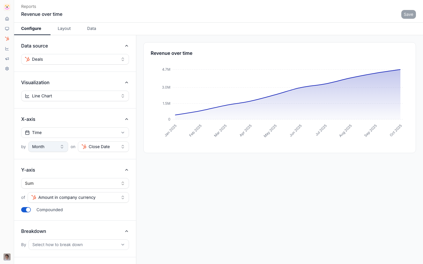
Before you start
How it works
Reports live under Track on the Reports page. Creating a report opens a builder where you choose a data source, then configure aggregation, grouping, filters, and a date property, and pick a visualization. The preview updates as you go. You save the report with a name, and a Data tab lets you inspect and export the underlying rows. New reports are private to their creator and become visible to others once added to a shared dashboard or embedded in a partner portal. Data sources include CRM-mapped objects like deals, contacts, and companies, plus Introw-native sources: partners, engagement, assets, certifications, commissions, emails, and MDF. Saved reports can be added to dashboards and embedded in partner portals.Settings & configuration
Reports are managed at Reports.Data source
Choose what the report runs on. Two families are available:
The Introw sources are what let you report on activity that has no CRM record: which assets partners
opened or downloaded, who earned which certification, which emails went out, how funds moved. MDF as a
source requires the MDF module.
Aggregation and grouping
Pick an aggregation, then a primary and an optional secondary grouping.
Ratio is the one worth knowing about: you set the report’s filters as the denominator and a second
filter set as the numerator, both on the same data source. Deals closed-won over all closed deals gives a
win rate; registrations accepted over all registrations gives an acceptance rate. Turn on Show as
percentage and it renders as one.
Partner account fields are aggregated the same way. The Partners source is not count-only: choose
Sum or Average and the metric picker offers the numeric and currency properties of the partner’s own CRM
record, which is where programs roll up numbers like total ARR, sourced revenue, headcount, or certified
engineers. So a field maintained on the partner account reports across the whole ecosystem, broken down by
region, tier, phase, experience, partner team role, or any other property on that record, and the same
report can be embedded in a partner portal. A blank value sums as 0 and is skipped by an average. See
Report on partner account fields.
Commission amounts across currencies. A report on the Commissions source converts each line to the display currency before it sums, averages or takes the minimum or maximum, so a program that pays in GBP, EUR and SEK shows one correct total instead of three currencies added as if they were one. The display currency is your company currency on the Reports page and the partner’s currency inside a partner’s portal. Conversion applies when multi-currency is on or you pay with Introw Pay. With neither, amounts are aggregated as stored.
Groupings cover time (week, month, quarter, fiscal quarter, year, fiscal year), any CRM property, and
the Introw dimensions: partner, partner tier, phase, experience, attribution, partner contact, partner
team role (one option per role), timeline event type, certificate, email template, MDF fund, asset, asset
viewer, asset mime type, asset category, and whether an asset was downloaded. Crossing asset with asset viewer and downloaded is how you get per-person
download reporting rather than views alone.
Visualization
Choose a bar chart, line chart, pie chart, single number, or table. A table report renders the records themselves with the columns you pick on the Data tab, which is also what makes a data-table widget on a dashboard. Display options cover axis labels and titles, legend and gridlines, data labels, compact and currency formatting, show as percentage, sort and top-N, zero and unknown handling, period comparison (against last week, month, quarter, fiscal quarter, year, fiscal year, or a rolling year), and a fixed colour per breakdown value so a series keeps the same colour every time the report is opened.Filters and dates
Apply filters and choose the CRM date property the report ranges over. Every property type offers Is known and Is not known; text adds contains and does not contain; dropdowns add Is any of and Is none of; dates add a rolling range as well as fixed dates. Rolling ranges move with the calendar and include This Month, Last Month and Next Month, so a close-date filter for the coming month stays current without editing it. If a role is scoped to its own partners, reports, dashboards, and partner analytics all narrow to that user’s partners automatically - no per-report filter to maintain.Drilldown
Charts are not dead ends. Click a point on a line chart - including multi-line and stacked-area charts - or a bar on a single-series bar chart, and the drilldown opens scoped to what you clicked. How the click is interpreted depends on the axis: a time axis narrows the date range to that bucket, and a CRM or other property axis adds an equality filter on that value. So a spike in a monthly trend is one click from the records behind it, with no rebuilding of the report and no manual filter. Drilldown scopes on the x-axis value only, not per series, so on a multi-line chart clicking a point narrows to that point’s bucket across the whole chart rather than to one line.Sharing
A report is private to its creator by default. Change its visibility to let the rest of your team view it or view and edit it, at any point after it was created. A report also becomes visible when it is added to a shared dashboard or embedded in a partner portal, where audience filters scope what each viewer sees.Raw data export
Use the Data tab to view the underlying rows and export them to CSV.How-to guides
Troubleshooting
You cannot create a report
You cannot create a report
You have hit your plan’s report limit.
A data source is missing
A data source is missing
The CRM object is not mapped, or the module (such as MDF) is off.
Numbers look off
Numbers look off
Check the date property, filters, and currency formatting.