

Where it lives
Mobile Experience lives at Portal settings.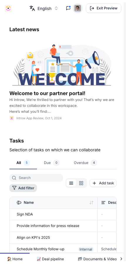
Before you start
How it works
The partner portal is responsive, so the experiences you build adapt to a phone screen with no separate configuration. Partners can install the portal to their home screen from their mobile browser, after which it opens full-screen like an app. The same login, branding, and content apply; only the layout adapts. There is no separate mobile build to maintain. When you publish or update an experience, the change reaches mobile automatically.Settings & configuration
There is no separate mobile setting to enable; the portal is mobile-ready by default. To make the mobile experience strong: Experience layout - keep sections and blocks simple so they stack cleanly on a narrow screen. Preview an experience at a small width before publishing. Branding - the logo, colors, and custom domain you set apply on mobile too, so the home-screen install carries your brand. Content - large embeds and wide tables are harder to use on a phone; favor concise sections for partners who are mobile-first.How-to guides
Troubleshooting
A section looks cramped on mobile
A section looks cramped on mobile
Simplify the layout and preview at a narrow width.
A partner cannot install to the home screen
A partner cannot install to the home screen
Confirm they are using a supported mobile browser and following the browser’s add-to-home-screen step.